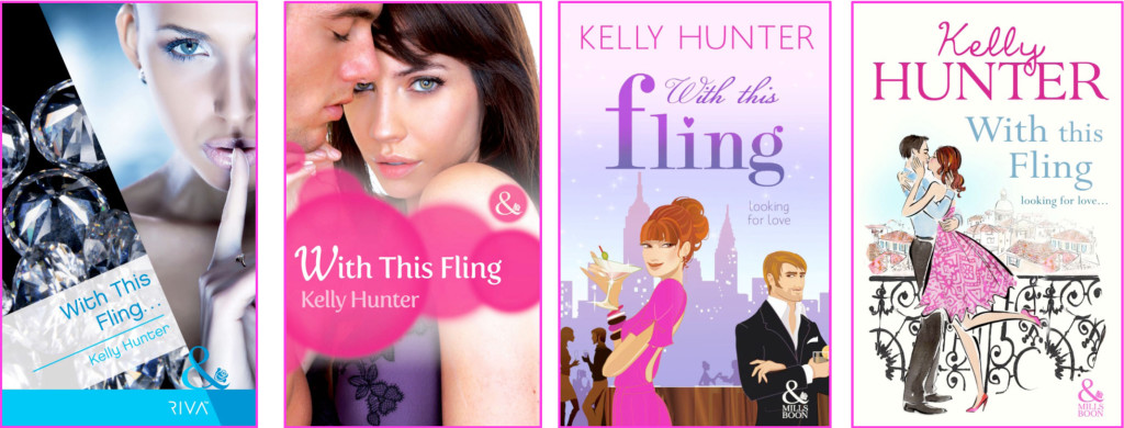
The UK Mills and Boon RIVA line that launched in January 2011 – formerly known as Modern Extra, and before that Modern Heat, and at one stage Nu Temptation – is getting a cover makeover and a relaunch towards the end of 2012.
Why?
Mumble mumble target readership mumble mumble pinpoint etc etc mumble probably to try and drive sales. That’s my take, anyway. To lift sales. And I’m all for lifting sales.
The guidelines I write to have not changed. The stories are still contemporary, short (50K) category romances with a youthful, urban feel. Not too youthful, mind. More of a sophisticated, sexy, rompy, smart kind of youthful, with depth. Okay, I’m doing a woeful job of describing the guidelines. If you want to know the exact wording of the publisher guidelines for Riva/Presents Extra go here.
But back to the covers. Harlequin Mills and Boon are conducting a survey this month regarding potential new covers for RIVA grown stories. If you’d like to take that survey and potentially influence the decisionmaking, go here.
If you’d simply like to ogle some different cover treatments of the same story, stay here. I like the last one best – the pen and ink smooch with the city rooftops in the background. The BIG author name and my preening Author Ego might also be murmuring pick me when it comes to that last cover, but the argument I’m going with is that I like having a couple on the cover of a sexy category romance, and I like the hint of an evocative setting in the background. So which cover do you like best? If you’re familiar with Riva stories, all the better. Do the stories fit the covers? I’m a little undecided.


5 Comments
The last one reminds me of Julia Quinn’s UK covers – they’re historical romances so quite different! Here are some:
http://juliaquinn.com/world/uk.php
Having looked at the other books, yours is the most reminiscent of Quinn’s though.
I think I prefer the second best – I don’t care for the split cover (isn’t that the current style?) and I guess I don’t associate M&B with illustrated covers.
Interesting that they’re doing a relaunch so soon.
Those UK Quinn covers are definitely not what I’m used to for Historicals. Bold choice.
Yup, the split cover is the current style and bald blue chick is perhaps not the best example of this type of cover. I quite like my latest split style cover (far right on blog, not part of the survey). The pink blobs on cover 2 don’t thrill me, but it does have a category line feel to it.
I like that you think those last two fit tone wise, Ros. I don’t read enough chicklit labelled stories to know if Riva stories have much in common with them. But I do know I want a man on the cover and not just the girl! Call me old fashioned…
Lissa, ironically retro. Liking the word combination, but then I like ironic anything. Perhaps I might suggest a little font irony inclusion. I’d be so popular!
That last one is definitely warmer and flirtier than the first two. Sort of a little bit ironically retro? Looks like Jill Mansell’s covers, which would not be a bad thing, as a) love her and b) similar feel to Riva stories?
I voted for the last one as well. I like that chick-lit style cover that reflects the tone of the Riva stories and still looks contemporary and fun. I’ll be interested to see what they pick – and fascinated to see if it really does influence sales.
I don’t remember it being ‘Nu Temptation’ but I can see why that name didn’t last!